
The Art of Seeing: Crafting Insight from Data
As a devotee of Edward Tufte, the pioneer of modern data design, we’re often reminded that visualization isn’t merely about aesthetics; it’s about clarity, precision, and truth. At Kairos Solutions, we build our dashboards around his "Data-Ink Ratio" principle: the idea that every pixel (or drop of ink) on a chart should serve a specific informational purpose, stripping away "chartjunk" like heavy borders or 3D effects that distract from the numbers.
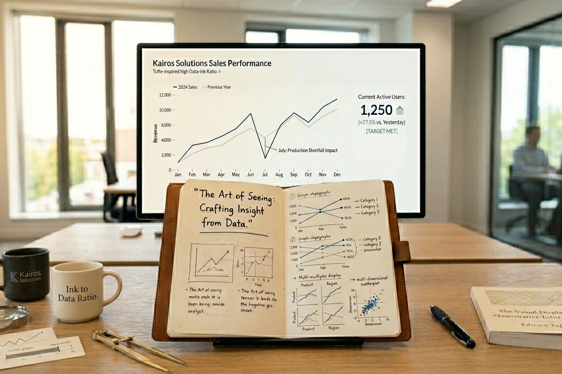
The Story is Paramount. Every dataset holds a narrative, and our role as visualization practitioners is to reveal it. Consider a simple line chart showing sales over time.
The bare lines show fluctuations, but what does it mean?
This is where the "so what?" comes in. A precipitous dip in July isn't just a data point; it's a call to action. Was there a production issue? A competitor's launch? The visualization should spark these questions and guide the viewer towards understanding the implications.
Context is King: The "Relative To..." Factor. Data rarely exists in a vacuum. Its significance often emerges when viewed in relation to something else. Imagine a dashboard showing current website traffic.
Is 1,250 active users good? Bad? Without comparing it to yesterday's traffic, or the monthly average, or a specific target, the number is merely informative, not insightful. A visualization that highlights "1,250 active users, +27.5% relative to yesterday" immediately provides context and value.
Ultimately, the goal of any data visualization is to be actionable. If our visualizations merely impress without empowering decision-making, we've missed the mark. At Kairos Solutions, we strive to transform raw data into clear, compelling narratives that drive understanding and inspire intelligent action.
PS - To be perfectly honest, a pie chart is the only visualization that actually provides more value if you eat it; it forces the human brain to compare angles and areas just to tell us that 40% is slightly larger than 35%. Unless you are literally illustrating the consumption of a dessert, your data deserves better than being sliced into a colorful wheel of confusion. What would Tufte say?